Good news, bad news in redevelopment of NT’s website

There’s no delicate way to put this …
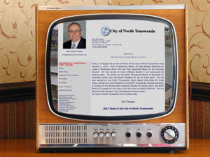
The website that serves the City of North Tonawanda is the worst in Niagara County.
It looks bad. The navigation is awkward. It’s rarely updated with new content. And because it’s so old and poorly designed, nothing is innovative.
It also lacks an acceptable level of transparency, according to the Buffalo Niagara Open Government report card. It recently awarded the NT website an ‘F,’ citing the failure to provide video recordings of meetings, outdated common council information, lacking a “Notify Me” option as well as other areas to improve.
The good news is that a completely re-designed website is in the planning stages, and council members have openly acknowledged the current site has been subpar for years.
The bad news is that in the effort to save some money the city is partnering with the school district — specifically tapping into the student body — to design, code and develop the city’s next-generation information portal.
This is a decidedly non-professional approach and seemingly contrary to what every other municipality in Niagara County has done with their web sites.
(My intent here is not to disparage anybody or discourage partnerships with the school district or city projects involving students. Unfortunately, the March presentation made by the well-spoken high-school student chosen to lead the design of this vital city function left little that was encouraging.)
His top recommendation was to make sure the new website scales properly to mobile devices, which the current site fails miserably at.
He also recommended offloading many functions of the website — like hosting photos — to Google services as well as eliminating many pages to make the site more streamlined.
His preview also retained the unusual alphabetical organization approach of the current website.
In addition to his limited availability during upcoming exams and moving away to college in the Fall, my biggest concern is how does a high-school student with very little experience in city government and civic affairs design a website that takes the presentation of this city, its citizens and businesses to the next level? Not to mention all the issues of transparency and additional self-reporting that should be built-into a next-generation website.
Mayor Pappas’ Administrative Assistant Peter Drossos is leading the city’s website redesign and is working with the student who made the March presentation.
Drossos said the Town of Lockport’s website is something he’d like to see emulated. Development of the site continues but currently there is no deadline or schedule of benchmarks to be met.
Other than the school district contribution, he said the project was being developed solely inside the administration and it was unlikely outside resident suggestions would be solicited.
Drossos also said “money is tight,” which is why the partnership with the school district is being pursued.
Is this, perhaps, a case of being “penny wise and dollar foolish?”
The city has the opportunity to create a website that advances an attractive, aesthetically pleasing image of North Tonawanda while also providing the site mechanics for a new commitment to transparency in government and getting the information residents want quickly and easily.
Something of this magnitude is a job for professionals, preferably a web-design firm with experience on municipal sites as well as a full committee that includes members of the community.
The citizens of this city — as well as those individuals who’d like to visit or move or start a business here — deserve a website that’s designed with their interests and needs in mind.
And much sooner rather than much later.
How long does North Tonawanda want to reign as having the worst website in Niagara County?
I’d much rather see it have the best …


